Select (multiple)
The Select (multiple) component allows you to choose more than one option from a drop-down menu.
Attributes: General
| Attribute | Description |
|---|---|
| ID | The unique ID of the component. |
| Label | The label of the component. |
| Label tooltip | Used to provide additional help or information to the user. When it is defined, a question mark icon appears in the component label. The text displays when the user hovers their pointer over the icon. The tooltip supports plain text only. |
| Value | The binding for the component. Use an expression to bind the component to its value and specify where the value is saved. For example, use {{myVariableName}} to store the value of the component in a variable named myVariableName. Use prefixes to define the scope of the value, for example, root. for referencing the root case to store the value in or parent. to store the value in the parent work item of the current one. For example, {{root.foo}} stores the value in the root case using a variable named foo. |
| Default Value | If a Value is not set, such as on Initialization forms, then this value will be used. |
| Description | Adds a description to the component. |
| Ignored | Determines if the component should be hidden and the value excluded from any payload. |
| Visible | Determines whether the component is visible or hidden. You can also use this expression to only show or hide the component based on another component. For example, if this component is bound to a checkbox component, you can use this expression to show or hide this component based on the checkbox selection made by the user. This is enabled by default. |
| Enabled | Determines whether the component is enabled or disabled. This is enabled by default. |
Attributes: Data source
| Attribute | Description |
|---|---|
| Items | When the data source is static, this determines the data that is shown. If you want to use dynamic values, provide an object that is declared as a list of maps which contain text and value elements. For example, def myDynamicOptions = [[text: "text1", value: "value1"],[text: "text2", value: "value2"]]. |
| Storage |
Specifies how the selected data is stored in the variable: Choose ID if you want to only save the value of the selected entry in the variable. You can then retrieve the value by using a form expression with the variable defined for the Value attribute, for example Choose Full value if you want to save the whole object. This enables you to retrieve other values of the selected element in the form, such as the name of the selected option by using a form expression with the variable defined for the Value attribute and the name of the field, for example |
| Format | An expression used to generate the label for each item. For example, the expression Mr. {{$item.name}} {{$item.surname}} is evaluated against the current work object and the selected item is available as $item. |
Attributes: Validation
| Attribute | Description |
|---|---|
| Required | Used to determine if the user must enter a value for this component. |
| Custom validations | List of additional validations you can apply. |
| Minimum elements | When multi-selection is enabled, this component specifies the minimum number of items to be selected. |
| Maximum elements | When multi-selection is enabled, this component specifies the maximum number of items to be selected. |
Attributes: Error messages
| Attribute | Description |
|---|---|
| Minimum elements | When multi-select is enabled, this determines the error message that displays if the number of items selected is less than the minimum specified in validation. |
| Maximum elements | When multi-select is enabled, this determines the error message that displays if the number of items selected is bigger than the maximum specified in validation. |
Attributes: Documentation
| Attribute | Description |
|---|---|
| Documentation | Allows you to explain concepts of the component's use for future reference. |
To add your drop-down options:
- Select the component on the canvas.
- In the attribute bar, select Items.
The Items dialog box appears.
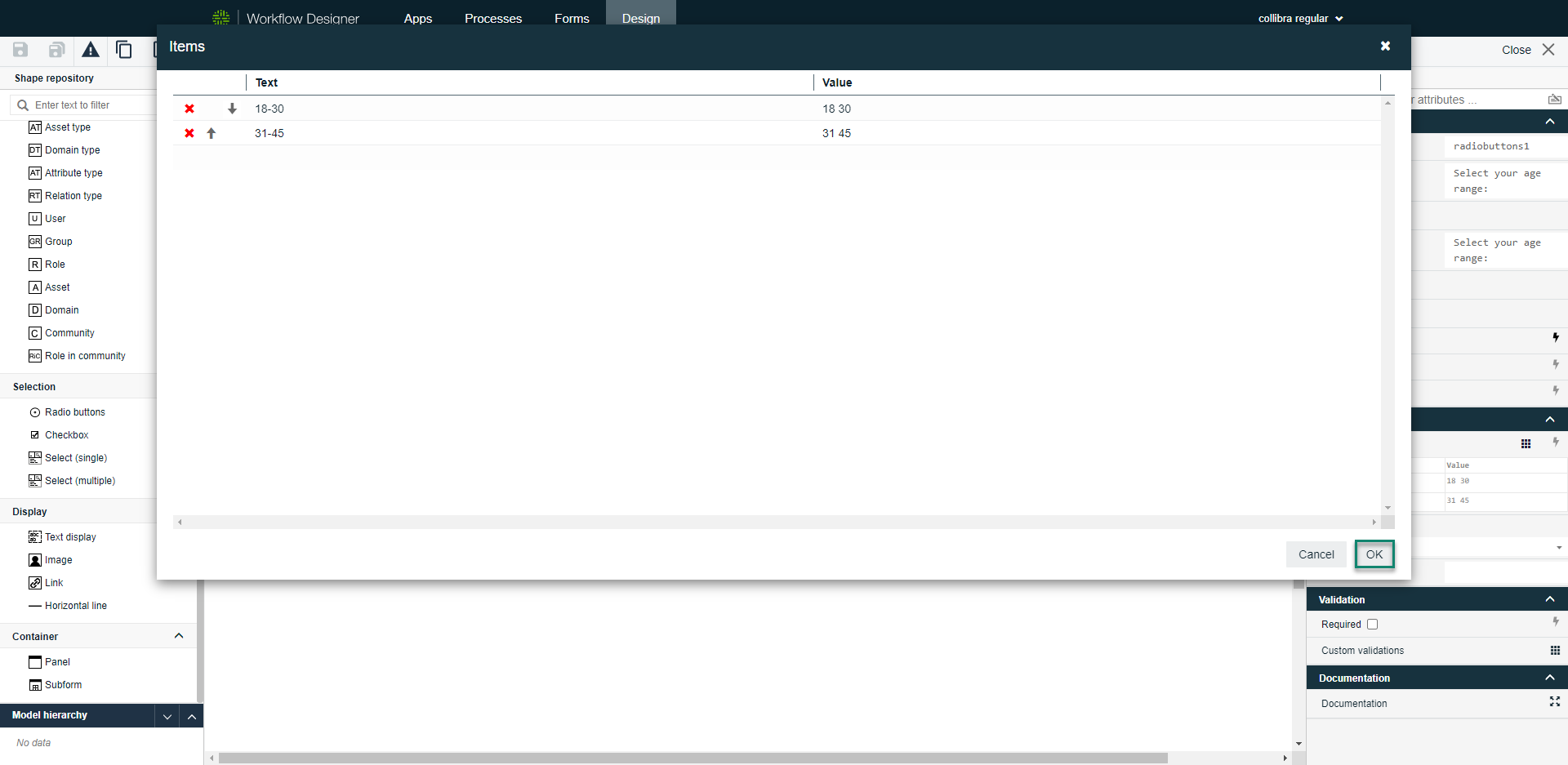
- Click an empty space below the column header to add an item.
- Click OK to save the items and close the dialog box.