Select
The Select components allow you to display data as a drop-down selection.
Attributes
| Attribute | Description |
|---|---|
| Items | The options that the drop-down displays and their values that you can use in form expressions or when writing script tasks. |
| Storage |
Specifies how the selected data is stored in the variable: Choose ID if you want to only save the value of the selected entry in the variable. You can then retrieve the value by using a form expression with the variable defined for the Value attribute, for example Choose Full value if you want to save the whole object. This enables you to retrieve other values of the selected element in the form, such as the name of the selected option by using a form expression with the variable defined for the Value attribute and the name of the field, for example |
| Value | The binding for the component. Use an expression to bind the component to its value and specify where the value is saved. For example, use {{myVariableName}} to store the value of the component in a variable named myVariableName. Use prefixes to define the scope of the value, for example, root. for referencing the root case to store the value in or parent. to store the value in the parent work item of the current one. For example, {{root.foo}} stores the value in the root case using a variable named foo. |
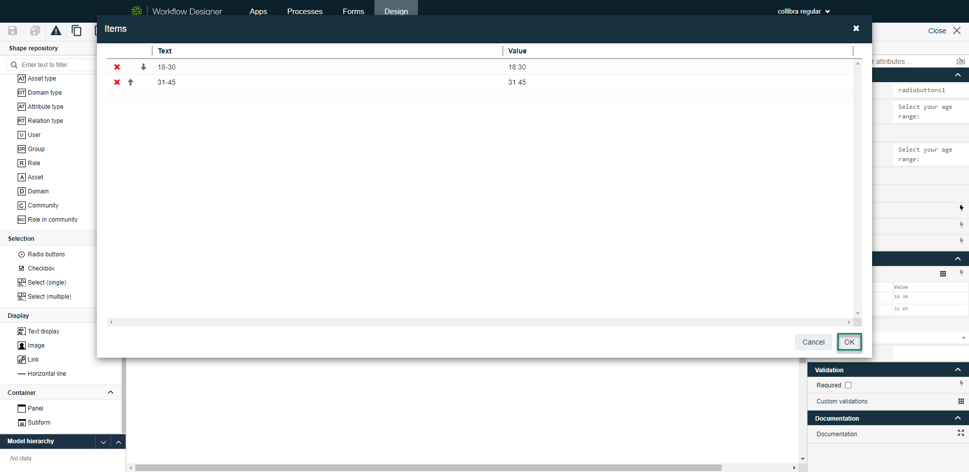
To add your drop-down options:
- Select the component on the canvas.
- In the attribute bar, select Items.
The Items dialog box appears.

- Click an empty space below the column header to add an item.
- Click OK to save the items and close the dialog box.