Display components
The following components allow you to configure the display the components on your form.
Text display
The Text display component allows you to display a read-only text in HTML format, including dynamic text based on expressions.
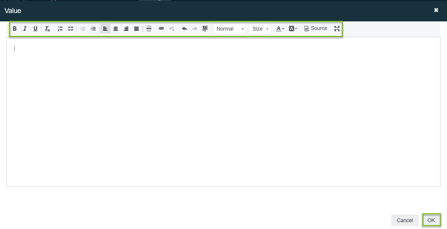
Adding the Text display component to the canvas automatically opens the rich text editor. You can also double click the component to open the editor.
Some HTML elements that are currently not supported, such as tables, are removed if you edit the form after saving it.
Use the toolbar to format your text, and then click OK to apply your text.
Attributes: General
| Attribute | Description |
|---|---|
| ID | The unique ID of the component. |
| Label | The label of the component. |
| Description | Adds a description to the component. |
| Ignored | Determines if the component should be hidden and the value excluded from any payload. |
| Visible | Determines whether the component is visible or hidden. You can also use this expression to only show or hide the component based on another component. For example, if this component is bound to a checkbox component, you can use this expression to show or hide this component based on the checkbox selection made by the user. This is enabled by default. |
| Enabled | Determines whether the component is enabled or disabled. This is enabled by default. |
Attributes: Validation
| Attribute | Description |
|---|---|
| Custom validations | List of additional validations you can apply. |
Attributes: Documentation
| Attribute | Description |
|---|---|
| Documentation | Allows you to explain concepts of the component's use for future reference. |
Image
The Image component allows you to display an image in your form based on a fixed or dynamic URL that uses form expressions.
Attributes: General
| Attribute | Description |
|---|---|
| ID | The unique ID of the component. |
| Label | The label of the component. |
| Description | Adds a description to the component. |
| Ignored | Determines if the component should be hidden and the value excluded from any payload. |
| Visible | Determines whether the component is visible or hidden. You can also use this expression to only show or hide the component based on another component. For example, if this component is bound to a checkbox component, you can use this expression to show or hide this component based on the checkbox selection made by the user. This is enabled by default. |
| Enabled | Determines whether the component is enabled or disabled. This is enabled by default. |
Attributes: Details
| Attribute | Description |
|---|---|
| Source URL | The image source URL. This is a mandatory field. You can also use expressions. |
| Image max. height | The maximum height of the image in pixels. |
Attributes: Validation
| Attribute | Description |
|---|---|
| Custom validations | List of additional validations you can apply. |
Attributes: Documentation
| Attribute | Description |
|---|---|
| Documentation | Allows you to explain concepts of the component's use for future reference. |
Link
The Link component allows you to display a relative or absolute URL in your form.
Attributes: General
| Attribute | Description |
|---|---|
| ID | The unique ID of the component. |
| Description | Adds a description to the component. |
| Ignored | Determines if the component should be hidden and the value excluded from any payload. |
| Visible | Determines whether the component is visible or hidden. You can also use this expression to only show or hide the component based on another component. For example, if this component is bound to a checkbox component, you can use this expression to show or hide this component based on the checkbox selection made by the user. This is enabled by default. |
Attributes: Details
| Attribute | Description |
|---|---|
| Link text | The text to display as the link. You can also use expressions, for example Navigate to {{asset.text}}. |
| Navigation URL |
The URL to navigate to:
The link can also contain expressions, for example https://<your_collibra_url>/asset/{{asset.value}}. |
| Target | Where to open the linked document:
To respect the user browser preferences, don't specify any value for this attribute. |
Attributes: Validation
| Attribute | Description |
|---|---|
| Custom validations | List of additional validations you can apply. |
Attributes: Documentation
| Attribute | Description |
|---|---|
| Documentation | Allows you to explain concepts of the component's use for future reference. |
Horizontal Line
The Horizontal line component is allows you to visually separate components in a panel.
Attributes: General
| Attribute | Description |
|---|---|
| ID | The unique ID of the component. |
| Label | The label of the component. |
| Ignored | Determines if the component should be hidden and the value excluded from any payload. |
| Visible | Determines whether the component is visible or hidden. You can also use this expression to only show or hide the component based on another component. For example, if this component is bound to a checkbox component, you can use this expression to show or hide this component based on the checkbox selection made by the user. This is enabled by default. |
| Enabled | Determines whether the component is enabled or disabled. This is enabled by default. |
Attributes: Validation
| Attribute | Description |
|---|---|
| Custom validations | List of additional validations you can apply. |
Attributes: Documentation
| Attribute | Description |
|---|---|
| Documentation | Allows you to explain concepts of the component's use for future reference. |