Form examples
This section contains examples of forms which can help you get started with creating your own forms.
Basic concept
If you add a text input component to the canvas, you will be asked to specify the label, for example First Name. If you do that immediately after adding the component to the canvas, Workflow Designer automatically creates a variable based on your input, for example {{firstName}}. You can also add or change the variable name in the General section in the properties bar.
The text value entered in the text input field is stored under this firstName variable, which you can use in other components to build dependencies between form fields.

Change the state of text input components based on the checkbox selection
You can control a form component using other components in your model. For example, if you have Disable checkbox, you can control your First Name component by establishing an expressions connected to the checkboxe. You can configure your fields so that if the Disable checkbox is selected, then the First Name component is disabled by using the expression {{!disable}} for the Enabled rendering property of the First Name component.

Mark a form field as mandatory if a value entered in another field meets a condition
Form expressions allow you to build dependencies between fields based on defined calculations. For example, it is possible to make a text input component required if the variable age is defined in another component as greater than 18. You would add the expression {{age>18}} to the Required field of the text input component.

Display assets only from a selected domain
By default, after selecting an option from any dropdown component in the Workflow Designer, the Value variable stores the ID of the selected dropdown option.
Some of the dropdown components have built-in filtering options available. For example, the configuration options of an asset dropdown component, allow you to filter assets by domain ID, asset type ID, domain type ID, and status ID.
To display assets from the selected domain only, you must pass the name of the domain dropdown variable to the appropriate filtering option in the asset dropdown.
JavaScript in expressions
You can also use JavaScript to create your expressions. For example, if you want to return the lower-case version of a string, simply add toLowerCase() at the end of your value: {{name.toLowerCase()}}.
It is also possible to chain several JavaScript functions. The following expression turns the name of a person into an email address: {{name.replace(' ', '.').toLowerCase() + '@collibra.com'}}.
Truthiness and Falsiness
JavaScript knows the concept of "truthy" and "falsy". This differs from the strict definition where a value is only true if it evaluates to a true boolean value.
A value in Form Expressions evaluates to true if:
- A value is the Boolean value
true. - A value is a string, such as Product A.
- A value contains an object, such as a date.
- A value is a number, positive or negative, with or without fraction.
- A value is an object
{}or an array[].
A value in Form Expression evaluates to false if:
- A value is the Boolean value
false. - A value is
null. - A value is
undefined. - A value is
0. - A value is an empty string, such as
''or"".
You want to change the state of an input field from disabled to enabled after selecting an asset from the asset picker. The variable defined in Value for the asset drop-down and any other drop-down component stores the ID of the selected option, for example {{asset}}.
The concept of "truthy" and "falsy" means you don't have to build a complex condition to evaluate the asset ID to true. To change the state of an input field from disabled to enabled, pass the variable of the asset picker to the Enabled property of the text input: {{asset}}.
Create a workflow with dynamic forms
This tutorial guides you through creating a Workflow Designer example workflow with dynamic forms.
Create a new app
Access the Workflow Designer and create a new app:
- In the navigation bar, select Apps.
- In the top left corner of the Apps tab, click ✚ Create app.
- Enter the required information:
- App name: HR verification process
- App key: The app key is automatically generated based on the App name value.
- Description: Although optional, the descriptions allow you to see an overview of the workflow purpose, for example This workflow demonstrates the use of dynamic forms through a process that versifies if an candidate can apply for a particular position.
- Click Create new app.
Your newly created app appears in the App models list on the Apps tab and you are redirected to the app editor page.
Add a process to your app
- In the app editor page, click ✚ Add model.
- In the What would you like to do? dialog box, select Create a new model for the app → Process.
- Enter the required information:
- Model name: HR process
- Model key: The model key is automatically generated based on the Model name value.
- Description: Although optional, the descriptions allow you to provide an overview of the workflow purpose.
- Click Create new model.
Your newly created process appears in the Business process models on the Processes tab and you are redirected to the process editor page.
Edit the process of your workflow
Your process already contains a start event.
- From the Shape repository, drag three User tasks to the canvas and place them to the right of the start event.
- For each user task, provide a name in the attribute bar, such as:
- Basic information
- Verification process
- Success confirmation
- From the Shape repository, drag an End event to the canvas and place it to the right of the last user task.
- Click the start event and then drag and drop a Sequence flow over the first user task.
- Use a Sequence flow to connect all the remaining components on the canvas.
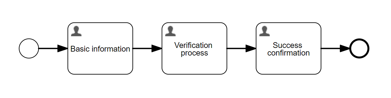
- Save your work.
Use the  Validate function for real-time form validation of your process to ensure its correctness without the need to deploy it first to Collibra. Any errors are displayed at the bottom of the canvas. Once addressed, you have the option to re-validate.
Add forms to user tasks
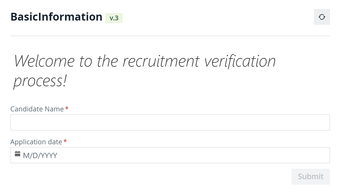
Basic information
The purpose of this task is to collect the candidate name and the submission date.
To create a form:
- Select the task on the canvas.
- In the Details section of the attribute bar, click Form reference to expand the properties.
- In the New tab, enter the required information:
- Name: BasicInformation
- Key: The key is automatically generated based on the name value.
- Click Create.
Your newly created form appears in the Form models list on the Forms tab and you are redirected to the form editor page.
You add fields to your form by dragging and dropping components from the Shape repository on the left to the canvas and editing their properties in the attribute bar on the right:
- From the Display section, add a Text display component.
- In the Value dialog box, enter a welcome message, for example Welcome to the recruitment verification process!
- Use the rich text editor to style your message.
- Click OK to close the dialog box.
- From the Data entry section, add a Text component.
- In the attribute bar, enter the required information:
- Label: Candidate name
- Value: {{candidateName}}
- Required:

- From the Data entry section, add a Date component to the right of the Text component.
The form canvas consists of multiple rows, each of them divided into twelve columns. All columns are equal in size. You can lengthen or shorten a component to fit into any number of columns and place more than one component on a row.
- In the attribute bar, enter the required information:
- Label: Application date
- Value: {{applicationDate}}
- Required:
- Save your changes.
Use the  Preview function to view and test your forms while you create them: to check required fields behavior, dependencies between form components, and how they look.
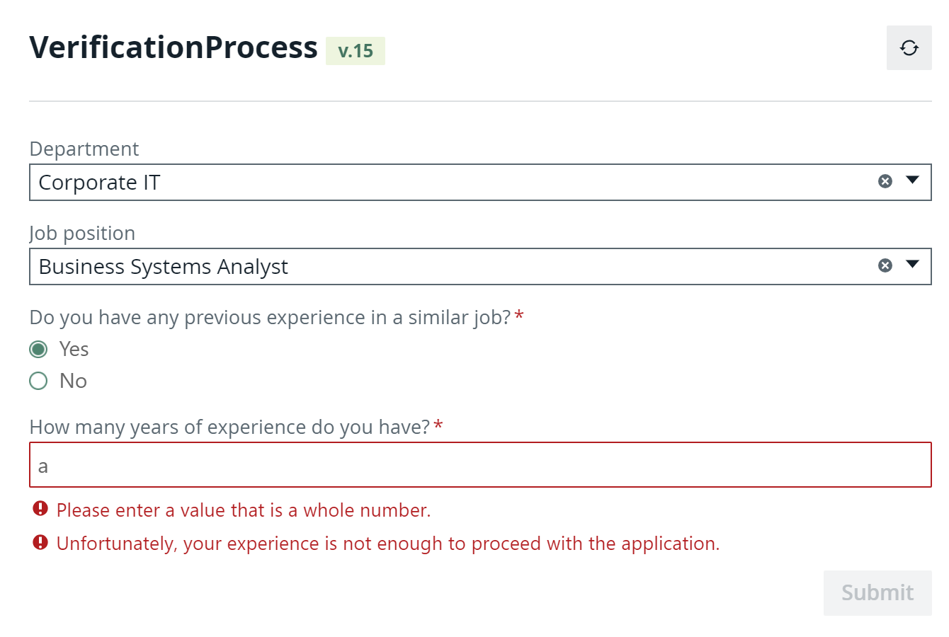
Verification process
This task allows candidates to select a department and a job that department and checks whether they have enough experience.
-
Create a new form for the second user task:
- Name: VerificationProcess
- Key: The key is automatically generated based on the name value.
If a form that you require already exists, you don't need to duplicate it. The Workflow Designer allows you to share forms between workflows. You can select an existing form in the Form reference properties in the Reference tab.
- From the Collibra data entry section, add a Domain component.
- In the attribute bar, enter the required information:
- Label: Department
- Value: {{department}}
- From the Collibra data entry section, add an Asset component.
- In the attribute bar, enter the required information:
- Label: Job position
- Value: {{jobPosition}}
- To restrict the list of job positions to the assets contained by the selected domain, add a dependency between the domain and asset components:
- In the attribute bar of the asset component, in the Filters section, select the
 runtime expression next to the Domain IDs attribute.
 - Enter the variable you defined for the domain component: {{department}}
- In the attribute bar of the asset component, in the Filters section, select the
- From the Selection section, add a Radio buttons component.
- In the attribute bar, enter the required information:
- Label: Do you have any previous experience in a similar job?
- Value: {{previousExperience}}
- Items: Click the
 items properties and enter the required information:
Text Value Yes yes No no - Required:
- From the Data entry section, add a Text component.
- In the attribute bar, enter the required information:
- Label: How many years of experience do you have?
- Value: {{experience}}
- To make this field visible and mandatory only if a candidate has any previous experience, add the following dependencies between the radio buttons and text components:
- In the attribute bar of the text component, in the General section, select the runtime expression next to the Visible attribute.
- Enter the following expression: {{previousExperience=="yes"}}
- In the Validation section, select the runtime expression next to the Required attribute.
- Enter the following expression: {{previousExperience=="yes"}}
- In the attribute bar of the text component, in the General section, select the
- To allow only numbers as an input for this field, add a regular expression validation:
- In the attribute bar of the text component, in the Validation section, select the Validation regex attribute.
- Enter the following expression: \d*
- Provide an error message for the text filed:
- In the attribute bar of the text component, in the Error message section, select the Validation regex attribute.
- Enter an error message, for example Please enter a value that is a whole number.
- To accept only candidates that have more than two years of experience, add a custom validation:
- In the attribute bar of the text component, in the Validation section, click the items properties next to the Custom validations attribute.
- In the Custom validations dialog box, click ✚ Add item.
- Enter the required information:
- Expression: {{experience>2}}
- Error message: Unfortunately, your experience is not enough to proceed with the application.
- Click OK to close the dialog box.
- In the attribute bar of the text component, in the Validation section, click the
- Save your changes.
Use the Preview function to view and test your forms while you create them: to check required fields behavior, dependencies between form components, and how they look. Since the preview is connected to your Collibra environment, you can see live data in the Collibra data entry components.
Success confirmation
The confirmation task shows a success image of your choice.
-
Create a new form for the third user task:
- Name: SuccessConfirmation
- Key: The key is automatically generated based on the name value.
- From the Display section, add an Image component.
- In the attribute bar, enter the required information:
- Label: You have successfully submitted our application.
- Source URL: Enter the link to an image of your choice.
- Save your changes.
About versioning
Throughout this tutorial, every time you modified and saved your process or forms, the Workflow Designer created a new version of that model. To access the history of a model:
- In the navigation bar, select Apps.
- In the App models list, select your app.
- For any process or form that the app contains, select
 → Details.
 - On the details page, click
 to see the history of the model.
 - Select any version to preview it.
- If required, you can use that version as a new version of the model.
Deploy your workflow
You can deploy workflows from the Workflow Designer to the corresponding Collibra environment with the push of a button:
- In the navigation bar, select Apps.
- In the App models list, select your app.
- From the app editor, click the Deploy button.
- In the Ready to Deploy dialog box, check the target environment.
- Click Deploy App to confirm and upload the workflow to the target environment.
Click the View in Collibra link from the success message to go directly to the workflow definition page where you can configure and enable it.